Applying Color Psychology To Your Dropshipping Store: What’s Best For Your Niche?
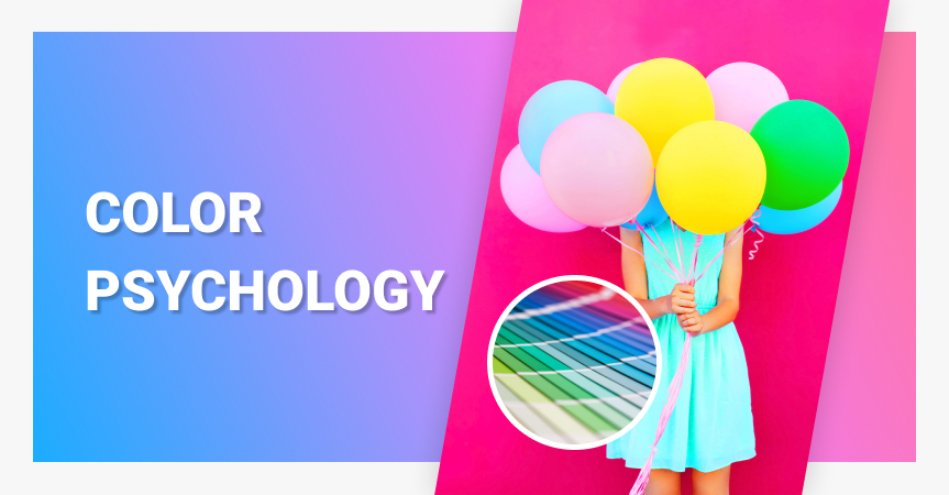
Why consider color psychology while creating design elements and palettes for your website? How to do it on a professional level? Let’s try to figure it out together!
When you choose colors for your website, it isn’t just about making it look pretty, cool or bright. Colors can do much more! In fact, a proper color palette can define the emotional reaction of a site visitor. Therefore, failing to choose the right colors can actually hurt your business.
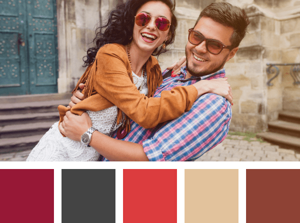
Does this example of a travel website motivate you to book a vacation here?…
Today we are going to talk about color psychology and the ways your color choices prompt the website visitors’ purchasing decisions.
What is color psychology
Color psychology is the study of colors, hues, and tones in relation to their impact on human behavior. Colors and emotions are interrelated. And although color associations are often personal or culture-determined, there are still certain patterns used in marketing to influence customers’ behavior.
Since colors affect people’s feelings and how they perceive certain information, content, ads, and products, color psychology is used in a variety of spheres. The color of products, their package, the walls in a brick-and-mortar store, and of course the colors used in your website design play an important role.
For example, would you feel like buying baby clothes from a website whose palette consists mostly of black and a bit of yellow? Or would you even stay on a website that uses green text font on a red background?

It means that when you build an online store from scratch, you can’t just pick your favorite colors and expect a lot of sales. Maybe you have good taste, but what if you don’t? So, let’s find out what colors mean.
List of color meanings
The meaning of colors can differ a lot depending on how they’re used, in what proportions with other colors, who the perceiver is, and many other factors. Still, we can outline at least the basic associations and emotions colors evoke.
- White
Although white can feel cold, it’s the color of purity, cleanliness, and peacefulness. It also creates a sense of space and freshness. That’s why many eCommerce websites use white as a background color.
- Black
Black can evoke a number of feelings and associations – both positive and negative. This color represents elegance and attractiveness, power and quality. Black also symbolizes death, sadness, aggression, fear, and grief.
- Red
Red provokes strong emotions (often contradictive) – passion and anger, love and danger, desire, dominance, power.
- Orange
It’s a very energetic and eye-catching color that symbolizes excitement, happiness, and beauty. At the same time, in Western cultures, it’s also the color of autumn (and Halloween too).
- Yellow
Yellow is a warm, bright, yet very tiring color (if you use it too much). It’s associated with the sun, cheerfulness, and energy. At the same time, it can be quite aggressive. Also, keep in mind that yellow can be difficult to read!
- Green
Of course, this is the color of nature – trees, leaves, grass, vast valleys, etc. It feels refreshing and calm and often symbolizes health (pharmaceutical companies often use it).
- Blue
It’s one of the cool colors reminding you of ice, snow, and winter. On the other hand, it’s also the color of water and sky, so it’s associated with tranquility and stability.
- Purple
This color occurs rarely in nature, which is why it’s associated with mysteries, royalty, and wealth. In some cases, purple can symbolize wisdom and spirituality. In any case, this color is very exotic.
Color psychology for online store owners: the basics of color theory
How can you combine colors to make them look great in each other’s company?
Generally, we can divide colors into 2 broad categories:
- Chromatic colors
This group includes the basic spectral colors (red, orange, yellow, green, blue, indigo and violet), as well as their hues like purple, cyan, ultramarine, etc. Additionally, they are also commonly divided into warm colors (yellow, red, orange, etc.) and cool colors (cyan, blue, violet, etc.).
- Achromatic colors
These are black, white and all the shades of grey.
One can describe any of the existing color as a combination of three parameters:
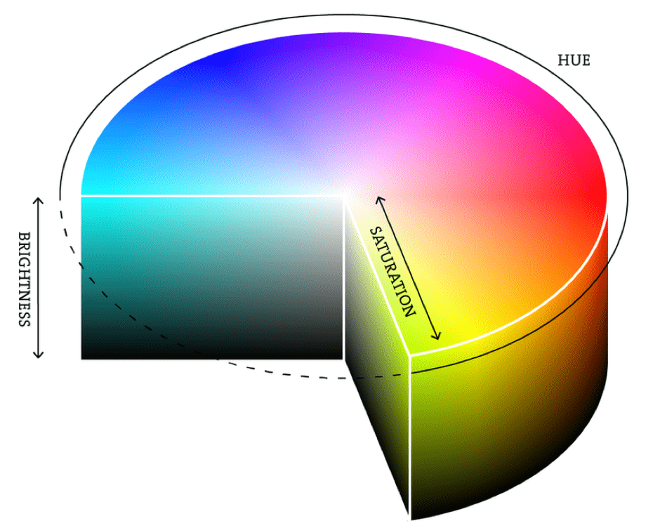
- Hue indicates the place of the color on the spectrum. For instance, if you choose yellow and change its hue, it’ll change into green, then blue, and so on.
- Brightness, in simple terms, indicates how close the color is to black or white. Any colors with maximum brightness will result in white, while minimum brightness will result in black.
- Saturation indicates how close the given color is to the corresponding achromatic color, i.e. a shade of grey. Decreasing the saturation of any chromatic color will make it faded and eventually turn into grey.
Okay, but why is all this important to web designers and online store owners?
When you modify any of the color’s parameters (hue, brightness, or saturation), you create countless variations of this color. These variations might look more interesting (richer, deeper, more complex, etc.) than the original color and even cause varying emotional responses.
So, when you experiment with different color variations, you don’t simply improve the visibility of your in-store links and buttons (which is extremely important, of course!). You also make a step towards building a unique and memorable brand image, and shape the visitors’ attitude to your website.
How to pick matching colors?
To make your website look well-balanced and harmonious, you need to pay special attention to the choice of colors in your palette. You usually pick one primary and a number of complementary colors. The color schemes below will help you create an aesthetic shopping destination.
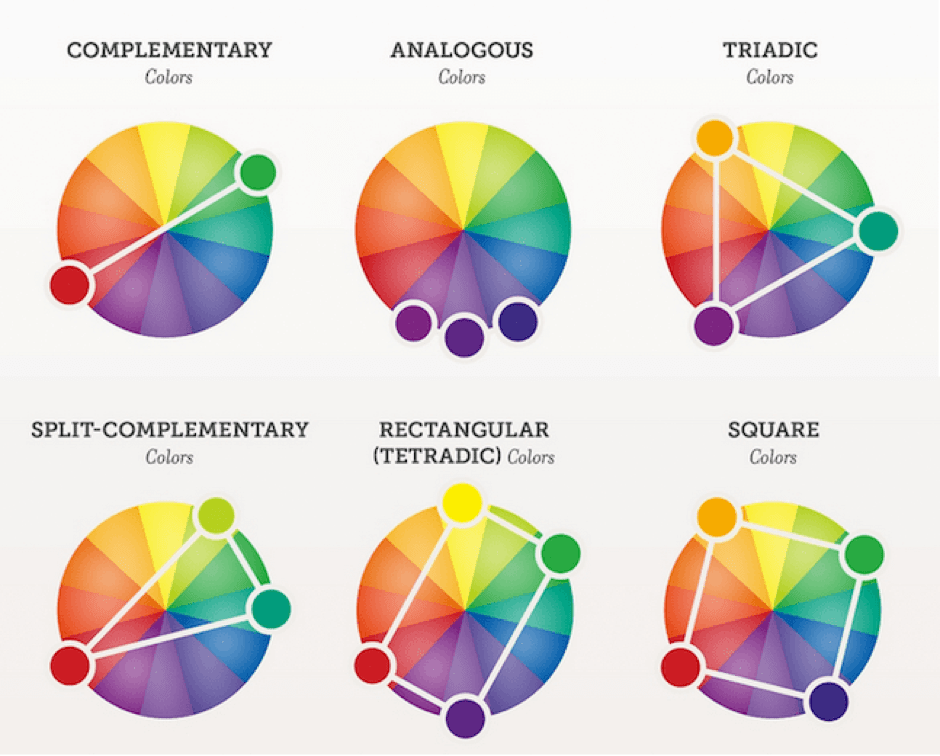
- Complementation is based on choosing two high-contrast colors from the opposite sides of the color wheel. Be careful though. Such pairs contrast very much, which isn’t always good. Try reading red font on a green background, and you’ll know what I mean.
- Analogue colors. You take one color as your primary and add the two nearest ones from the color wheel as secondary colors.
- The triadic scheme is a more balanced approach when you combine three colors equally spaced around the wheel.
- Split complementary is similar to complementation, but instead of using an opposite color, you use its nearest neighbors.
- Rectangle scheme is based on using analogous colors and their opposite complements. It’s a rich scheme with plenty of possibilities, but you’d better focus on one primary color.
- Square scheme is similar to the previous one, except the four colors are equally distributed on the wheel.
If you find these schemes too complicated but still want to use color psychology in your website design, try one of dozens color palette generators. If there’s a particular color in your head, but you have no idea how it’s called, try using a color picker of some kind.
In any case, it is generally a good idea to use not more than three colors in your palette. White usually works well as a background color, while others work perfectly if you want to emphasize important parts.
How to use the power of color psychology for a niche store design
Now, you know the theory on this interesting matter – let’s move on to its practical side!
We’ve prepared sample color palettes that, in our experience, prove to be the best choice for top dropshipping niches
1. Fashion & accessories
For clothing dropshipping, you want to use bright and contrasting colors. It helps website visitors focus their attention on the products and also motivates them to make a purchase. The choice of color depends on the type of goods. For example, softer colors will suit summer clothes for women; beach clothes may require brighter colors, while strict stylish clothes mix well with darker shades, even with black.
2. Technology, devices, computer supplies, gadgets, etc.
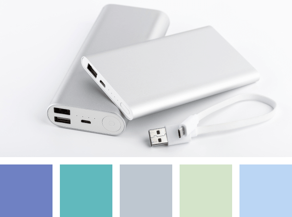
If you have chosen this niche, remember that the best palette for this sphere is a combination of black and white as well as metallic colors. They are associated with high-tech and future.
White is a great background, while black is easily distinguished. This strict and simple mix is generally preferred by sophisticated individuals.
3. Health & wellness
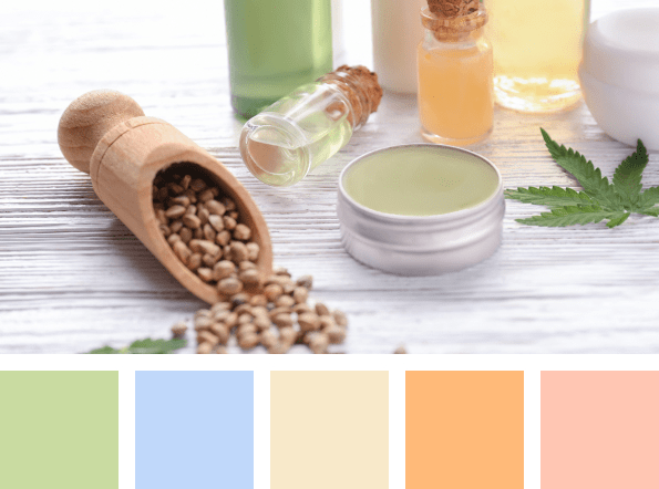
Nature is associated with endless grass fields, slopes and forests. Vegetation is a strong image for a modern person, so green is a good choice for anything related to vitality, safety, health and wellbeing.
The green color is the most pacifying one. It is often used for advertising drugs and medical goods. Mixing it with other soft natural colors will work well too.
4. Babies & parenthood
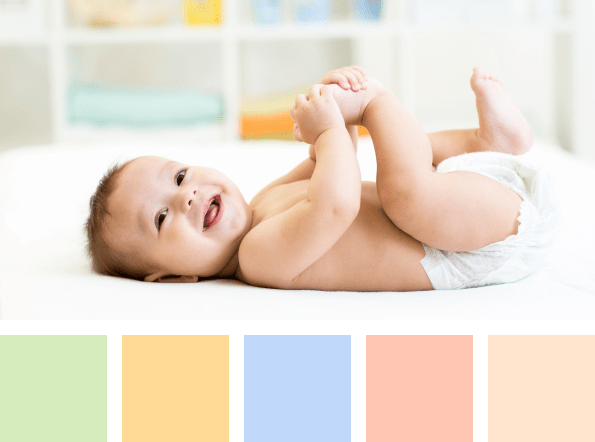
Expecting a baby is an exciting feeling full of warmth and love. So when dropshipping baby products you’d prefer warm colors such as red, yellow and orange as they represent kindness, tenderness and coziness. However, you want to avoid bright and strident colors. Take softer shades instead.
5. Kitchen supplies
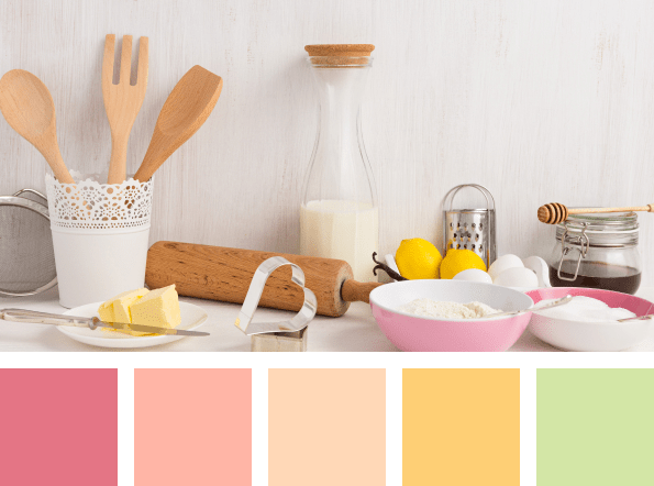
Some people see cooking as a necessity, while others really enjoy the process. In any case, when using color psychology for a kitchen products dropshipping website, you can choose any natural color or the colors of vegetables, but you really want to use faded shades.
Web designers usually prefer warm palettes as these colors are associated with coziness, trust, good mood and evoke appetite.
6. Beauty
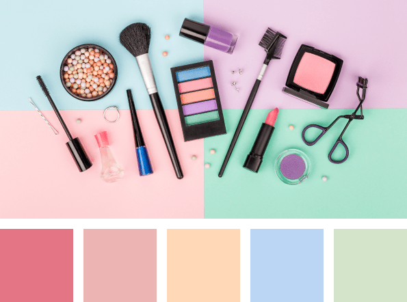
When dropshipping beauty products you should use a palette of rich colors, many of which are identical to the color of powders, lipsticks and other cosmetics. Warm hues are your best choice, but make sure the colors are not too blatant.
7. Jewelry and fashion jewelry
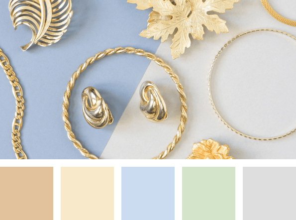
As you could expect, gold and silver will work best for jewelry dropshipping store. You can also use the colors of different gems. These hues represent wealth and luxury. But keep these colors quiet because you don’t want them to outshine the products.
8. Home décor

For home décor dropshipping niche, you must create a cozy and friendly atmosphere that will welcome your customers. Color psychology says that warm, quiet colors are just what you want as they help people relax and feel comfortable.
9. Educational toys
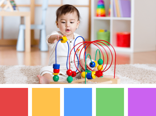
Educational toys often have bright, vibrant colors as they stimulate concentration and brain function to draw a child’s attention. So for the website, you should choose harmonious colors.
10. Pet supplies & accessories
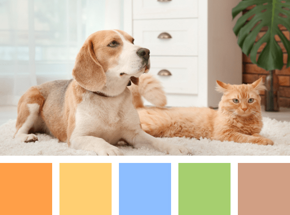
When dropshipping pet products, web designers usually work with dimmed colors to create the feeling of coziness, warmth, kindness, and fluffiness. Warm hues will work best as yellow represents a positive attitude, while orange evokes tenderness and love.
11. Outdoor activities
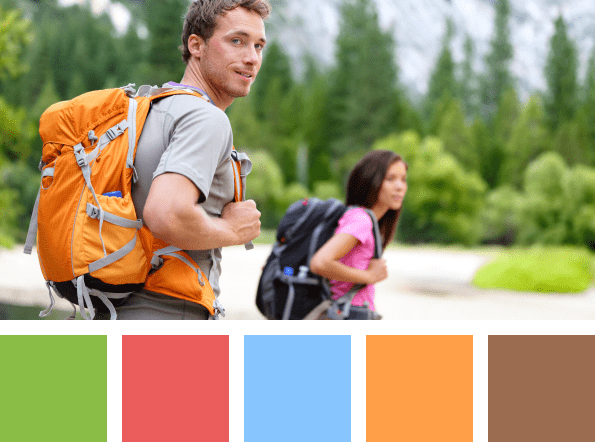
For travel and outdoors dropshipping niche you want to use bright and contrast natural colors, which you expect to see outdoors. They represent motion and activity stimulating and inspiring people to go outside and move.
12. Sports
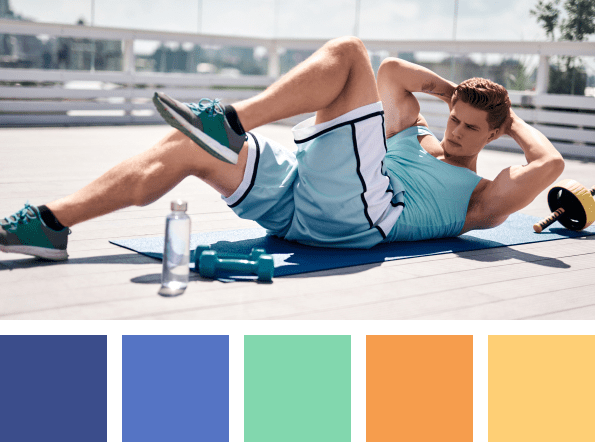
The same goes for sports, but here you want to create an atmosphere of concentration and ambition. So use softer shades like blue to dropship sporting goods. Green also symbolizes health so it can go to the palette too.
Color psychology and culture
Another thing you should know is that certain cultures interpret colors a bit differently than you and your fellow citizens. It mostly depends on the local tradition.
For example, red and green (and golden) have a close association with Christmas in Western cultures. Black is the mourning color in the West, but in Asian countries, on the contrary, white color has this symbolic meaning.
Depending on the culture of your potential customers, you might want to watch out for it in order to avoid embarrassment.
On the other hand, you can and should use traditional colors for seasonal events and holidays. For example, pastel colors are generally in use for Easter, while black and orange are a traditional choice for Halloween. So use it to your advantage to create special event banners and pop-ups.
Now that you’ve gone through our ultra-short course of color psychology, you’re ready to choose the right palette for your dropshipping store. And remember: you won’t have to do the job yourself if you claim our offer for FREE store!
Recommended for You