24 Steps To Creating Landing Pages That Convert Like Crazy
As a store owner who is passionate about your business, you must have already explored the benefits of effective landing pages and studied the tips from our team to increase conversion rate of an online store. To state the obvious, landing pages are great. But just building one doesn’t guarantee you’ll double your yearly revenue overnight. You have to stick to the golden rules to motivate a prospect to stay and scroll down. We’ve prepared some insider tips to help you create landing pages that convert by offering visitors an incredible experience which keeps them coming back.
What are the keys to creating landing pages that convert?
Make sure your messages are consistent
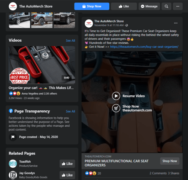
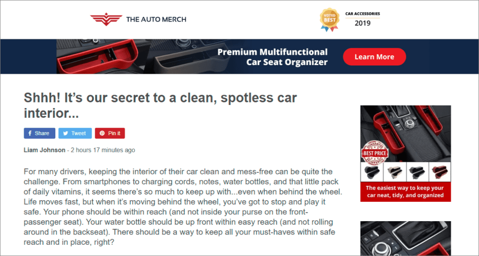
It is important for your landing page to fulfil the promise of the ad. It should not only match the messaging used in your ad (copy, branding, logo, images), but also expand on it. This is vital if you want to deliver a consistent experience and increase brand discoverability.
Let’s take a look at how our digital marketers handle the messaging. Their Facebook ad goes like this:
When visitors land on the landing page, they see a story that closely relates to the ad they just clicked. Mismatches always lead to high bounce rates and lost sales. You wouldn’t want to throw money out of the window, would you?
Focus on one goal
All landing pages that convert well have a very important thing in common: only 1 conversion goal (purchase) and only 1 place to click (the ‘Buy now’ button). Stick to one idea, otherwise, your visitor might get confused if they are bombarded with multiple calls-to-action.
Forget about navigation
Keep all the information in one place to ensure uninterrupted conversion flow. Every new click is another roadblock for your prospect that distracts them from the goal. Without exit points, your visitors can concentrate on what really matters. In fact, we’ve already removed navigation from the templates for our Landing page add-on to help you keep the focus.
Get a higher SEO ranking
Landing pages are crafted to target a specific set of search terms. This moves the landing page up in ranking and get your product, promotion, or sale in front of people searching for similar topics.
Grab attention
A benefit-focused or problem-focused concise headline is a must! Make one that clearly illustrates what you have to offer, why your product is worth purchasing, and why visitors should trust you.
Write a compelling value-based copy
Your product description should look like a consistent and compelling story that communicates benefits and creates involvement. By the way, the same benefit language might do wonders for the product title as well. Play up your product’s benefits: tell what makes it special, how it is going to solve your customers’ problem and make their life better / easier / safer / healthier, etc. Here’s where you can address potential worries and objectives before they even come up. Seeing your offer from different aspects help a lot to drive home your value proposition. Feel free to use icons, gifs or emojis to spice up your copy a bit and break it down into manageable chunks.
Tell a relatable story
Nobody would mind hearing the story behind a product they’re about to purchase. Building a narrative around your goods might be a breathtakingly successful selling technique. Touch on the problem your prospect might be having and offer your solution. You can try your hand at illustrating a certain use case or describing the manufacturing process. Think what language your audience relates to and how you’re going to talk to your customers: should you use formal language or will a few jokes work better?
The effort put in to create an emotional and relatable experience will be paid off a hundredfold.
Create a standout call-to-action
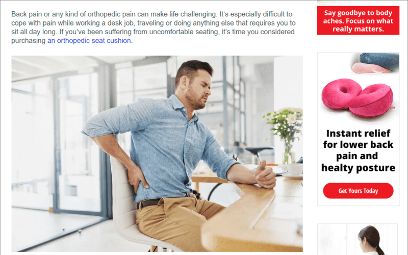
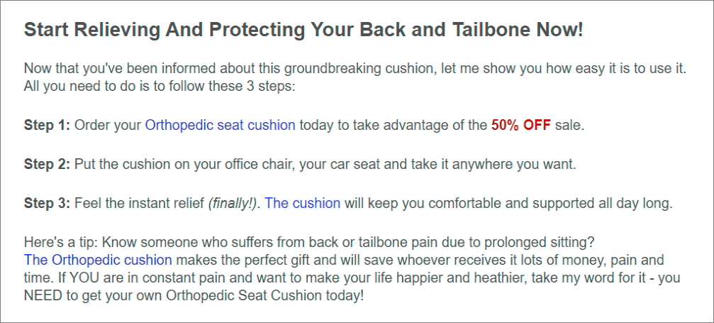
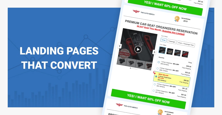
Essentially, landing pages that convert all boil down to the call-to-action button. It should be descriptive and action-oriented and contrast with all the other elements on the page to attract attention. Instead of the typical ‘Add to cart’ copy you can go with something like ‘Send me my orthopedic cushion now!’, ‘Yes! I want my order now!’ or ‘Rush me my order!’.
Make sure your customers have a CTA close at hand throughout the whole page by using the double (or triple) CTA strategy. The first button is for visitors who are ready to go ahead. Add another button for those who are on the fence and need to see more selling points so they can checkout without having to scroll back up.
There’s no need to have the same text in all the buttons. On the contrary, it’d be wiser to formulate offers in a different way.
Understand where to place CTA
CTA buttons like “Download Now”, “Sign Up”, and “Join Now” should be next to the “magical moment” of the product you are selling.
If you read the header of a section describing a feature that excites your users, the CTA should be very close by. It is at this point that a user is most likely going to be convinced to use your product, which means there should be a “Sign Up’ or ‘Download” button very close by.
It would help if you placed a CTA button above the fold. If you hide the button below the fold, many customers won’t scroll to find it. You have to put it right in front of their face and make clicking as easy and frictionless as possible.
Without a CTA, your landing page serves no purpose.
Showcase visuals
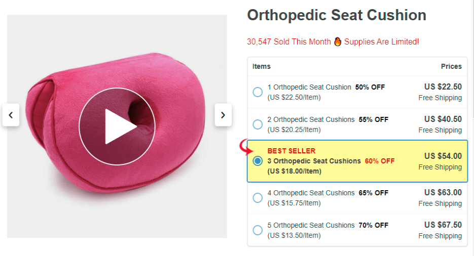
Visuals have proven to heavily affect purchase decisions, so be sure to show engaging images that give visitors a clear idea of what they’ll get and how they’ll benefit from the product. You can help your customers get an even better understanding of the product by showing it in action. Use callouts (lines of copy describing the product features) that spell out the quality and value of the product.
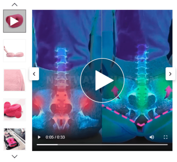
Include a video explainer
This is a time-proven method to boost customer engagement and increase conversion rate.
Provide detailed product information
Don’t underestimate the power of item specifics and go into as many details as possible: material, sizing, dimensions. If necessary, include some care instruction to show that you care! Besides, shoppers may need an explanation of what it is and why they need it if your product is unique or new to the market.
Feature the ‘How it works’ section
You might want to include this content block to your landing page in case you sell a complicated product, a device that is new to the market, or just want to make sure your prospects fully understand what your product is about. Plus, it can be another chance to point out all the perks your product has.
Answer frequently asked questions
This is a great way to address potential worries and objectives and drive home your value proposition. And do we need to mention that websites that cover more questions a prospect might have tend to show lower return and refund rates?
Leverage social proof
Nearly 90% of consumers trust online reviews as much as personal recommendations, so don’t miss the chance to reap the tremendous benefits of showing testimonials from happy customers directly on your landing page. A dash of social proof will be a nice contribution to the credibility of any store. Want to go even further? To rack up some extra conversions, ask your customers to record a video review. According to Google, nearly two thirds of shoppers say video reviews encouraged them to make a purchase.
Encourage social sharing
Help your customers promote your product by giving them the opportunity to spread the word on social media. Social sharing buttons = high impact with no efforts required.
Give coupon codes
With selling your product at a discount price, it’s much easier to outperform competitors. This works especially well if you show your prospects that the promo code is time-sensitive.
Improve page load speed
Page load speed tops everything.
Without a fast loading page speed, the majority of users will bounce without even seeing the other key elements of a well-designed landing page. After all, you can’t convert and sell on the best-designed landing if no one is around to see it.
It’s essential for optimizing conversions to have a page that loads quicker than that of your competitors.
Users are increasingly impatient and expect web pages to load in less than two seconds, especially mobile. Having a landing page that loads quickly leads to a seamless user experience.
Add scarcity and create a sense of urgency
People subconsciously consider things that are hard to get as valuable and exclusive. The fear of missing has always been (and always be) a powerful conversion driver. To let your prospective customers know that your supplies are short, show how little of your offer is left, use a countdown timer and words like “ends soon” or “last chance”. Small changes, big results.
Add contact details
Show your customers that you’re available and happy to help in case they have a question or need a hand.
Comply with the data protection requirements
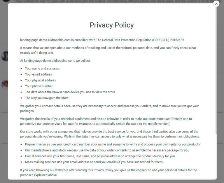
Pages like Privacy policy, Terms of use, Return policy are a must for every website so don’t neglect to let your customers know that you respect their privacy. But how to prevent them from getting lost wandering on your website? We’ve taken care of it! To reduce the number of exit points on your landing page, utility pages are open in a pop-up window.
Give an extra nudge with the exit intent pop-up
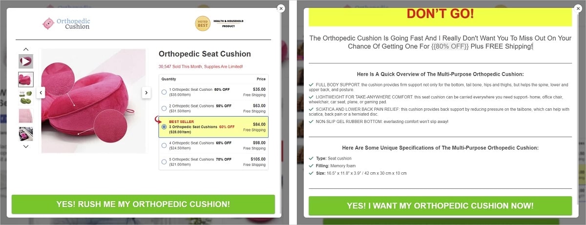
To create an extra appeal and give a nudge to those who are interested but not quite sold yet, use the exit pop-up feature. The add-on detects when someone is about to leave the page and shows a pop-up window that restates your value propositions and gives your abandoning visitors another reason to stay on the page. This exit-intent trigger does an excellent job of reducing your bounce rate and inspiring more sales.
A/B Test Your Landing Page
Once you have your landing page ready, don’t just let it sit there. Look at your metrics to see how it’s performing.
Are you seeing the number of conversions you expected? If not, where are people getting lost?
Gather information on your landing page’s performance by looking at heat maps, scrollmaps, and user recording sessions to see if there’s any room for improvement.
Then, test different design versions of your landing page against each other to see which one performs better. By A/B testing and further refining your landing pages over time, you’re making sure you get the best performance out of your traffic – and advertising dollars.
Bonus tip!
Looking for more ways to guide visitors to the checkout page? Here’s the trick you’ll definitely want to use: link each mention of your product and images to the second page of your funnel. Wherever your prospects click, they will be brought closer to the checkout page. That’s what we call a streamlined experience.
This is all for now! Now that you know everything about creating landing pages that convert, it’s time to put them into work. How about starting now? 😉
