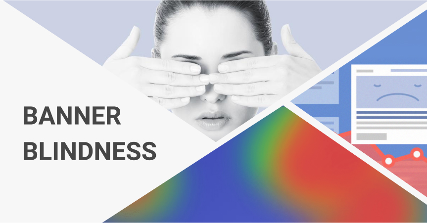
Banner Blindness: Why Most People Don’t See Your Ads And What You Can Do About It
Digital marketing uses a rich variety of methods to advertise products and services to potential customers. However, the efficiency of these methods is strongly affected by banner blindness. Keep reading to learn what it is and how to overcome it.
If you promote your business online, you probably use a lot of digital ads including banners and pop-ups. But what if I tell you that the majority of people to whom these ads were shown up until now never saw them? They’re simply not noticing such elements, and this situation is widely known as banner blindness.
What is banner blindness?
Banner blindness is a term meaning that internet users ignore banner ads and banner-like information on webpages. It’s also called ad blindness. According to a study conducted back in 2013, 86% of website visitors experience the effects of banner ad blindness.
It can happen consciously or unconsciously and affects not only banner advertising but anything that looks like banners as well.
Why do people develop banner blindness?
It may seem strange that people ignore banners and other ad types, because such elements are made so that anyone could notice them in a moment. Bright colors, large fonts, eye-catching images – designers do their best to create the best banner ads possible.
But despite these efforts, many people stay inattentive to online advertising, and the average click through rate (CTR) of all ads equals 0.05%. It’s because this kind of behavior is learned through experience.
Try visiting any website (with all ad blocking tools turned off) and calculating how many irrelevant blocks there are. According to the market research firm Yankelovich, we used to see about 5,000 messages including ads every day in 2007. As for now, some say the figures have doubled but no official statistics is available.
With so much information around us, we have no choice but to learn how to skip unnecessary and irrelevant elements. Besides, people usually browse the internet in search of specific data and hate to be distracted with commercial information (especially when it’s irrelevant).
Another factor is our own experience with thousands of websites we have visited. Most of them have similar structures and layouts. For example, most people look for a web page’s logo in the top left corner of the screen. But this similarity has taught us where ads are usually placed.
How do you overcome banner blindness?
1. Keep content away from ads
Human mind perceives objects located close to each other as a single group with similar or the same functions. As a result, if a piece of content is placed near ads, this content is seen as another ad and is therefore ignored.
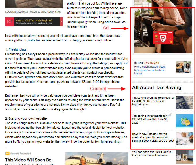
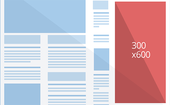
On this web page, there’s a high chance users will look at the top right corner, see the ad and decide that the whole section contains only ads. However, there’s a number of internal links, which site visitors will ignore because they saw the ad first.
So, to avoid this effect, don’t group internal links near ad banners.
2. Reconsider where you put ads
After years of browsing the internet, most people know exactly where typical site elements are located. Often banners are placed at the top of the page or on the right side of the screen.
So, in order to attract site visitors’ attention, you can experiment with non-standard ad placement. For example, it’s a good idea to try placing banners between blog posts.
3. Use native advertisements
Although I did recommend keeping content away from ads, placing an ad inside your content is another story. This method is called native advertising.
Users usually explore content by the F pattern. They read horizontally, then descend and repeat. And that’s where an ad can achieve the highest results – as long as it’s relevant to the content.
Native advertisements are materials that are placed among the content of a site and look like another piece of content. Promoted posts you often see on social media are a good example. The only thing indicating that it’s an ad is the ‘promoted’ tag.
That’s why promoting dropshipping products on social media is so efficient, especially when you use video ads.
4. Make ads less prominent
Another reason why native ads cause banner blindness less often than typical banners is because such ads often look similar or identical to other content pieces on the site.
When marketers started using the internet for advertising, they believed that an ad should look bright and eye-catching. Well, technically they were right. This is the first ever banner ad:

It’s click-through rate was 44% which is absolutely unbelievable nowadays. Back then, the idea was new and people were curious. But as more and more sites began to show unrelated banner ads, visitors learned to distinguish them from actual content.
As a result, if an ad has a prominent design which makes it very different from the rest of the site, there’s a high chance visitors won’t even look at it. That’s why it’s a good idea to conceal an ad as a part of the content by using similar style, the same colors, fonts, etc.
5. Experiment with sizes, colors and formats
The first banner was a success because of its novelty, which means ads won’t provoke banner blindness if you can make them non-standard. To do it, experiment with different ad formats, or use nontypical sizes, or use unexpected images, etc.
It’s really hard to give any advice here since the whole point is to create something truly unique.
6. Indicate benefits
Even if users do notice your banner, there’s no guarantee they’ll click on it. There could be many reasons why including the fact that a given banner is unrelated to the content of the page. But there’s something all bad banners have in common – they don’t tell people about the benefits of clicking.
Marketers differentiate features of a product and the benefits of using it. In short, features are what a product can do. Benefits are what buyers get from it.
The difference is huge as customers only think of benefits. And if you want them to click on an ad, make sure to promise them certain benefits rather than proudly describe how cool your product is.
7. Test options
Finally, make sure to use A/B tests on all options you have, be it banners’ location, formats, colors or anything else. You never know what will work better because it depends on your target audience and their expectations, your content and many other factors.
If you’re looking for an all-in-one solution for dropshipping business that helps you overcome the effects of banner blindness, AliDropship plugin is just what you need. Creating a store on its basis, you can enjoy a whole range of dropshipping themes specifically developed to make your store visitors excited with their on-site experience, and plenty of supporting solutions.
Recommended for You