How To Create An Online Store With An Exceptional Shopping Experience?

Do you enjoy shopping online? Most people do, but not always and not everywhere. Some online stores offer a frustrating experience with poorly organized catalogs, unzoomable pictures, and confusing navigation.
For online stores, proper design is crucial. We all want our customers to enjoy their experience from the moment they open the page until they complete their order. Unfortunately, not all sellers consider this, leading to many online stores with subpar shopping experiences.
So, how can you solve this problem and help others enjoy online shopping to the fullest? By starting a customer-centered online store. Let’s explore how UX designer Kate Choi created a top-tier website. Spoiler: you can now get your own online store with expertly crafted design for free!
Online shopping: a pleasure or a nightmare?
How often do you shop online? Is it always a success? While online shopping is incredibly popular, user experience can often be problematic.
Issues like difficult navigation, poor image quality, and unclear product details can turn a pleasant shopping trip into a frustrating experience.
According to a study by the Baymard Institute, 69.57% of online shopping carts are abandoned, with 25% of users citing navigation issues as the main reason. This shows how critical website design is for the survival and success of an online store.
Let’s review some of the most common problems online shoppers encounter so you can be well-prepared.

Common pain points in online shopping
Starting an online store can be exciting, but it comes with its challenges. Here are some common issues shoppers face:
- Navigating the store: Many users find it hard to locate what they need due to poorly organized websites. They want to find items quickly without guessing where to click.
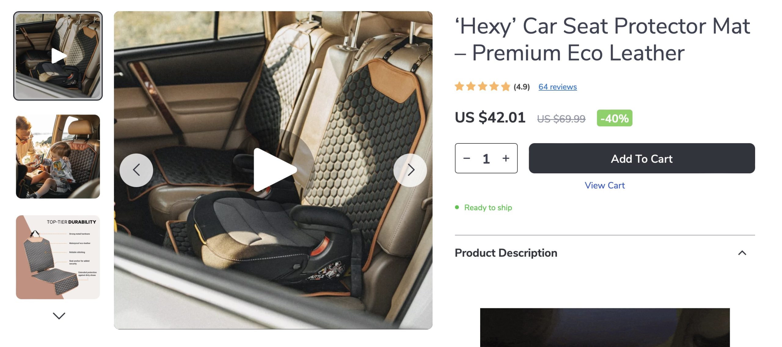
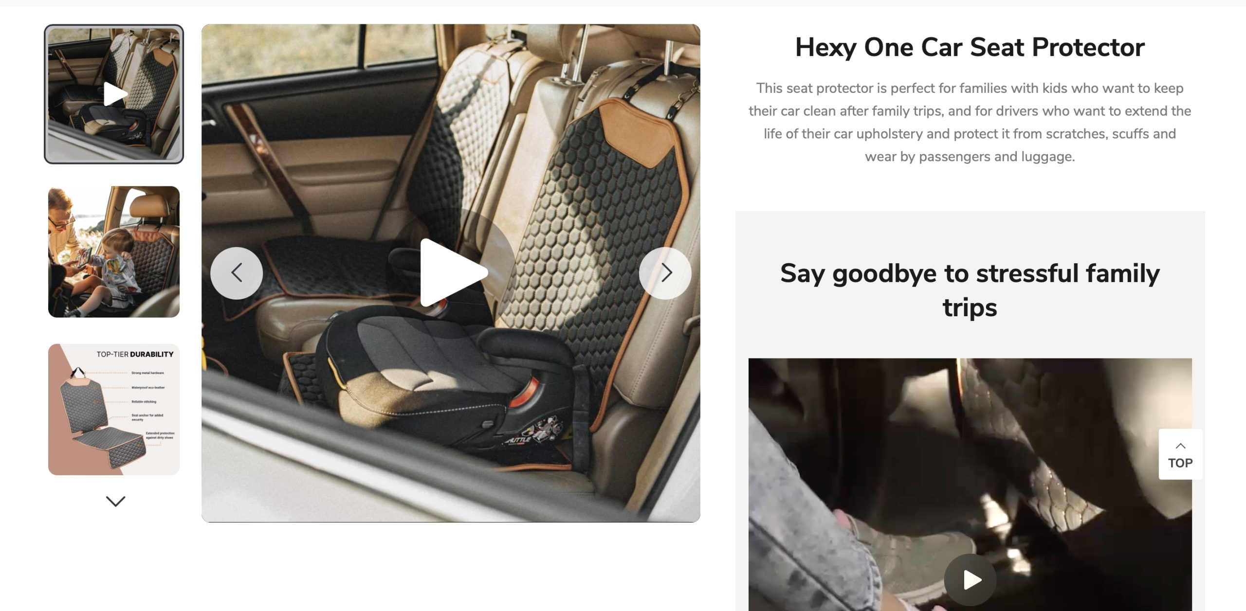
- Product images: Low-quality or insufficient images can make a website look unprofessional and reduce trust. Shoppers want clear, detailed views of products.
- Product details: Missing or unclear product information, especially regarding size and fit, can be frustrating. No one wants to buy a product they don’t fully understand.
- Checkout process: Complicated and lengthy checkout processes often lead to cart abandonment. Shoppers prefer a quick and straightforward way to complete their purchases.
A well-designed, user-friendly website can turn first-time visitors into repeat customers. Wondering where to find such a store? You can create one yourself!
Ensuring a pleasant shopping experience: a case study
Meet Kate. Frustrated with the poor user experiences of many online stores, she envisioned a site that was both beautiful and functional. Here’s how she built her ideal ecommerce store:
- Simplified navigation: Kate made sure users could easily find what they needed with clear categories and filters.
- Enhanced product display: She used high-quality images and detailed descriptions to help users make informed decisions.
- Streamlined checkout: By creating a hassle-free checkout process, she encouraged users to complete their purchases.
User-centered design
User-centered design puts the user at the heart of the design process. This means understanding their needs, behaviors, and goals to create a product that truly serves them. For online stores, this approach can lead to higher satisfaction, increased engagement, and more sales.
Here’s how you can create a user-centered store:
- Understand user needs: Know what your users want and what frustrates them.
- Ease of use: Ensure your store is simple to navigate.
- Accessibility: Make your website accessible to all users, including those with disabilities.
- Appealing visuals: Create an attractive and engaging visual design.
Okay, so what did Kate do to achieve success?

The design process
Step 1: Research
User interviews and surveys
Kate started her project by doing some research. She talked to potential users and asked them to fill out surveys to understand their shopping habits and preferences. She found out that users valued:
- Easy navigation: They wanted to filter products based on their needs and use a search box to find what they were looking for quickly.
- Multiple product images: They liked having accurate product details and colors.
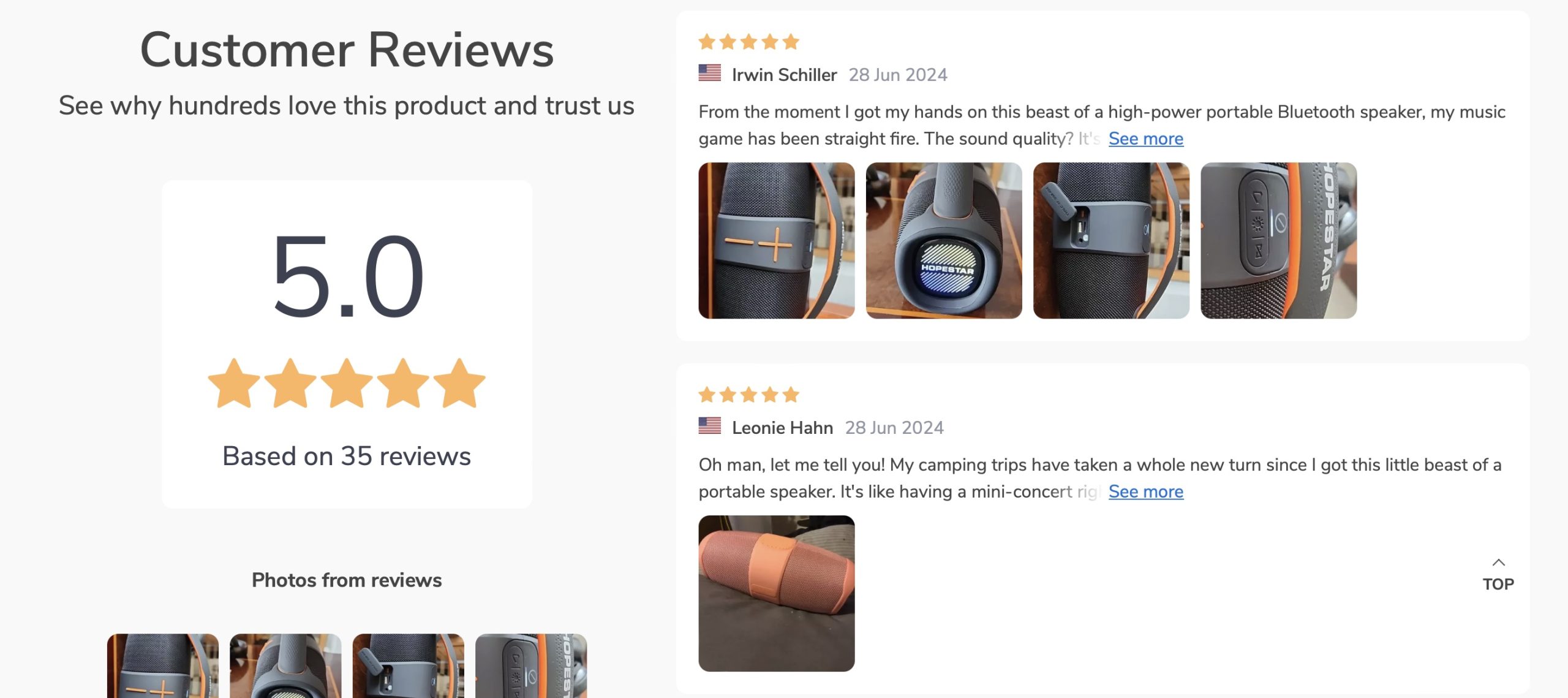
- Customer reviews: They appreciated reviews from other customers, especially those with similar body types, and photos of the products in use.
- Brand information: They wanted to know more about the brand and how the products were made.
Competitive analysis
Besides talking to users, Kate also looked at other successful ecommerce websites to see what they were doing right.
For example, big retailers like Amazon and Zappos are great at providing multiple product images, detailed descriptions, and user reviews. These features are part of why they are so successful.
By studying these successful sites, Kate could use some of their best practices in her own design.
Step 2: Planning
With all her research in hand, Kate organized the information and identified key themes. She then created user flows, which are visual guides showing the steps users take to do things like find a product or make a purchase.
Design
Next, Kate moved on to designing the website. She started with sketches to visualize the layout and created a mood board to set the visual style. A mood board is a collection of images, colors, and fonts that represent the desired look and feel of the design. She aimed for a simple yet modern appearance.
Step 3: Prototyping
Creating a prototype
Kate began by crafting a clickable prototype of her website. A prototype is essentially a working model that mimics the actual user experience, enabling designers to evaluate the website’s functionality.
Usability testing
Next, Kate focused on usability testing, an essential phase in refining the website. She conducted tests with five individuals, asking them to locate a specific product and proceed through the checkout process. The insights gathered highlighted several areas for improvement:
- Streamlining navigation by eliminating unnecessary options.
- Incorporating a size chart to provide clear information on sizing and fit.
- Adding icons to simplify adjustments in product quantities.
Step 4: Refinements
Armed with this feedback, Kate made several updates to enhance her design. She simplified the navigation, included comprehensive size charts, and boosted the overall user-friendliness of the site.
As a result, her ecommerce store became more accessible and efficient.
Step 5: The final product
The outcome was a streamlined ecommerce website designed to solve the challenges identified during the research phase.
- Easy navigation: With intuitive categories and filters, users could effortlessly find what they needed.
- High-quality images: The website featured multiple views and detailed descriptions to aid in decision-making.
- Simple checkout: A straightforward checkout process helped minimize cart abandonment.
- Customer reviews: Feedback and photos from other buyers offered valuable insights.
- Brand transparency: An ‘About’ page provided details on the brand’s history and product sourcing.
