How To Turn More Browsers Into Buyers: Conversion Optimization For Ecommerce Websites
Running an online store? Then you already know the drill – you’re bleeding cash to get eyeballs on your site. But here’s the kicker: what good are all those visitors if they’re just window shopping and ghosting you at checkout? That’s where conversion optimization for ecommerce website magic happens – or as insiders call it, ecommerce CRO.
Forget the traffic rat race – this is about squeezing way more value from the people already knocking on your door.

Why you can’t afford to ignore this anymore
Let’s do some quick math that’ll blow your mind: say you’re getting 10,000 people through your virtual doors every month. At 2% conversion, that’s 200 sales. Bump it to 3%? Boom – 300 sales. Same traffic, zero extra ad spend, 50% fatter wallet. Pretty sweet deal, right?
Your secret weapon for actual growth
The reality is, driving traffic costs a fortune, everyone’s fighting for attention, and shoppers are pickier than ever. That’s why working on your conversion rate is your actual lifeline for growing without going broke. The winners today are just making it dead simple to browse and hand over the credit card.
But wait, there’s more. A store that’s firing on all cylinders gets people spending more per visit through clever suggestions, stops them from bailing mid-purchase, and turns one-time buyers into regulars. Every tweak you make – shaving off load time, writing clearer copy, streamlining that checkout flow – stacks up like Lego blocks.
Why tiny tweaks = major cash
Let’s say you’re pulling in $50K monthly at 2% conversion. Push that needle up just one percentage point, and you’re looking at an extra $25K dropping into your account every single month. No wonder ecommerce CRO is called the “growth multiplier effect.”
When you figure out what makes people click “buy” versus “meh, maybe later,” you sharpen everything – your ads, your emails, your whole marketing game. Instead of throwing spaghetti at the wall or copying your competitors like everyone else, you’re making moves based on actual human behavior.
Investing in conversion optimization for ecommerce website growth is like putting money in a high-interest account – it compounds like crazy. Now let’s figure out where your store actually stands and what’s really going down on your site.
First things first: Take your store’s temperature
Here’s a rookie mistake: jumping in and changing stuff before you know what’s broken. You need a proper “before” snapshot. Otherwise, you’re flying blind – you won’t know if your “fixes” actually fixed anything or just moved furniture around.
Think of your conversion funnel as the journey every shopper takes – from “hey, what’s this site?” to “take my money.” Usually looks something like:
Landing → Checking out products → Tossing in cart → Heading to checkout → Actually buying
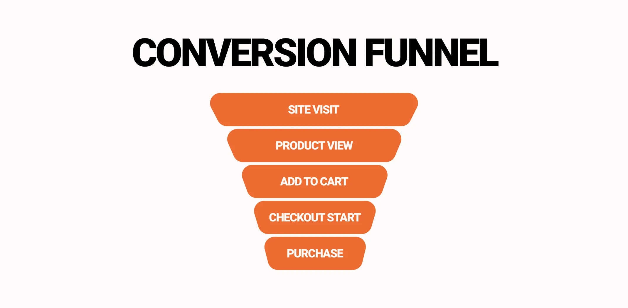
Calculating your conversion rate is brain-dead simple: purchases ÷ total visitors × 100. So 1,000 visitors, 30 buyers = 3% conversion. This number tells you how well your site actually works at turning tire-kickers into paying customers, and it’s ground zero for any smart strategy.
But don’t just stop there and pat yourself on back. Slice and dice that data:
- By device (desktop vs mobile) – mobile usually lags behind, but the upside is massive
- By where they came from (paid ads, organic Google, email blasts, social media) – some channels crush it, others… not so much
- By what they’re shopping for – spot which products or price points are duds
- By whether they’re new or coming back – repeat customers usually convert like gangbusters
Once you carve up your data like this, patterns jump out at you. Maybe your mobile checkout is a disaster zone. Maybe people from Instagram ads bounce faster than a rubber ball. These breadcrumbs point you straight to the juicy problems worth fixing.
Tools like Google Analytics 4, Hotjar, or Clarity can paint this picture for you visually. Mix those hard numbers with the softer stuff – heat maps showing where people actually click, recordings of real sessions, quick pop-up surveys – to understand the “why” behind people bailing.
Nailing down this baseline gives you two superpowers: crystal-clear vision and laser focus. No more guessing games – just priorities ranked by impact, and later on, you can measure every win with cold, hard numbers.
Next up, let’s turn those numbers into actual moves – finding the sticky spots and goldmine opportunities that’ll move the needle the most.
Hunt down the friction: Where your money’s leaking
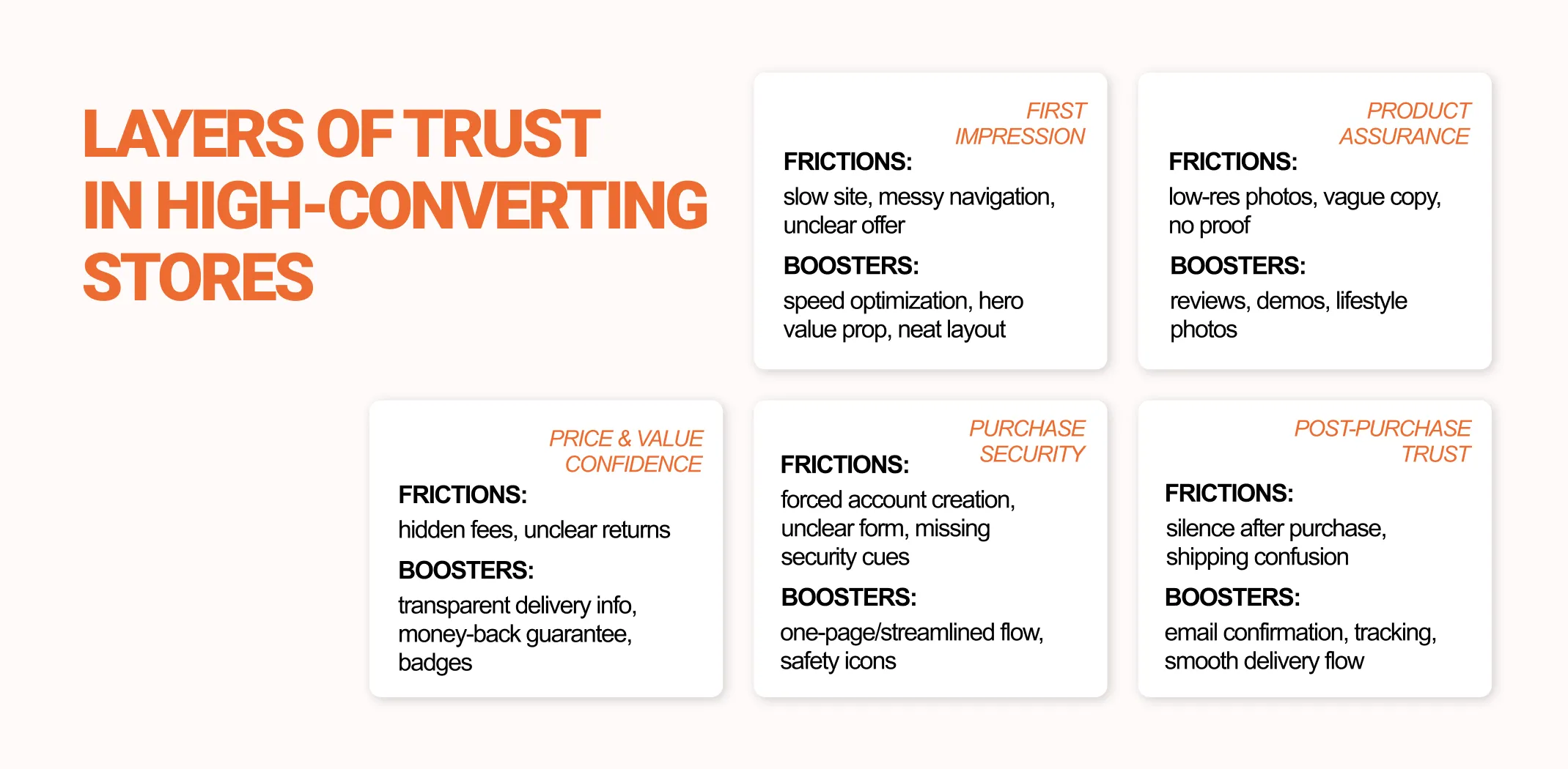
Now that you’ve got your numbers, time to channel your inner Sherlock. Somewhere between your homepage and that final “complete purchase” button, people are slipping through the cracks – and your mission is figuring out exactly where and why.
Here’s the uncomfortable truth: most online stores aren’t bleeding money because of traffic problems – they’re hemorrhaging cash because of friction. Friction = anything that slows shoppers down or makes them second-guess themselves. Picture little speed bumps scattered everywhere on your site. The fewer bumps? The smoother the ride to checkout.
Smart way to prioritize? The PIE framework – Potential, Importance, and Ease:
- Potential: How much room for improvement exists here?
- Importance: How many people actually hit this spot?
- Ease: How painful would fixing this be?
Zero in on high-potential, high-importance zones first – your product pages, checkout flow, and mobile experience are usually the big kahunas.
The usual suspects for friction include:
- Glacial loading speeds (especially on phones) – we’re talking one second can tank your conversions hard
- Chaotic navigation that turns shopping into a scavenger hunt
- Terrible product discovery – filters that don’t filter, search that finds nothing, categories that make zero sense
- Trust issues – missing reviews, sketchy return policies, surprise fees popping up like whack-a-mole
- Checkout nightmares – death by a thousand steps, forcing account signups, accepting like two payment methods
To spot these landmines, combine data detective work with actual human observation. Analytics shows where people bail, but heat maps and session recordings show you why. You’ll catch shoppers frantically scrolling, rage-clicking the back button, or getting stuck on forms that won’t cooperate.
Better yet, just ask people directly. Slap up a quick exit survey: “What made you pump the brakes on buying?” The honesty is usually refreshing: shipping costs were bonkers, delivery took too long, or they couldn’t find their size.
After mapping out all the friction points, flip the script – where are your hidden opportunities? Maybe that “you might like” section gets clicked like crazy but leads to a dead end. Or people linger on certain category pages forever but never add anything to cart. Each of these moments is a goldmine waiting to be tapped.
Mix number-crunching with real customer voices, and you’ll end up with a hit list of high-impact zones ready for some serious optimization love.
Up next: the crown jewel – your product and category pages, where buying decisions actually get made.
Product & category pages: Where wallets open
This is where the rubber meets the road – your product and category pages are literally where sales live or die. Visitors land here, poke around, and decide “yes” or “nope.” Getting these pages dialed in is absolutely critical for solid conversion optimization for ecommerce website results.
Before we dive into specific tweaks, let’s peek under the hood at what actually makes people whip out their wallets – because understanding the psychology makes the tactics way easier.
What really makes people click “buy”
Sales don’t just magically happen. Every single element either nudges people toward buying or shoves them away:
1. Design & first impressions
You get about 3 seconds before people judge your whole store. Clean layouts, color palette, and fonts you can actually read make you look legit and trustworthy. Killer product shots, zoom-in features, quick videos, and breathing room help people absorb info fast and feel good about buying.
2. Navigation & the flow
Think of navigation like GPS for shopping. People should never feel like they’re lost in a maze. Obvious categories, filters that make sense, breadcrumb trails – these move people smoothly from “just looking” to actually buying. When finding stuff takes seconds instead of minutes, frustration plummets and conversions skyrocket.
3. Product descriptions & the words you use
Benefits beat features every time. Keep it short, make it scannable, use bullet points to highlight what makes this thing special. Talk about what it’ll do for them, not just what it is. Nobody cares about “aerospace-grade aluminum” – they care about “won’t break when you drop it.”
4. Trust signals & social proof
Humans trust other humans way more than marketing speak. Star ratings, verified reviews, customer photos, security badges – these tell visitors “yeah, this place is solid.” Stick these near your buy buttons so shoppers feel confident pulling the trigger.
5. Buy buttons (those CTAs)
These are your gentle (or not-so-gentle) pushes toward purchase. Put them where eyeballs land first, use words that spark action (“Add to Cart,” “Get Yours Now”), and keep the style consistent everywhere.
6. Smart product suggestions
Show related stuff or “people who bought this also like…” items to boost how much people spend without being annoying.
7. Pop-ups & behavioral triggers
Exit offers, flash discounts, newsletter prompts – these nudge people back into the buying mindset at clutch moments.
8. Micro-interactions & engagement tricks
Little touches matter – hover effects, scarcity messages (“Only 3 left!”), countdown timers, live chat bubbles – keep people engaged and moving toward that purchase. These small details punch way above their weight class.
9. Mobile & speed optimization
Slow-loading pages and janky mobile layouts are conversion killers, full stop. Make buttons thumb-friendly, keep layouts clean, load pages lightning-fast. A quick fix here often means serious money in your pocket.
Stack all these elements together right, and your product pages become conversion machines – guiding people smoothly and building trust like crazy.
Checkout & post-sale: Seal the deal
Your product pages convinced someone to buy – congrats! But if your checkout is a hot mess, confusing, or slower than molasses, you just wasted all that effort. Optimizing checkout and what happens after is where you turn the thirst into actual dollars in your bank account.
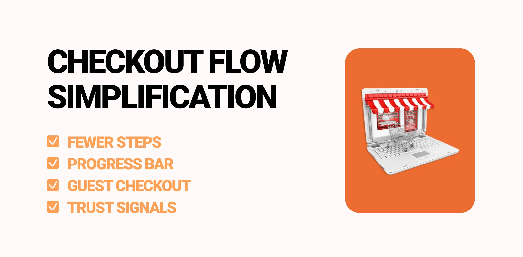
Strip checkout down to the bare bones
The fewer hoops between “Add to Cart” and “Thanks for your order,” the better. Here’s how to make it frictionless:
- Keep forms minimal: Only grab what you absolutely need. Don’t force account creation – let people check out as guests and get on with their lives
- Show the finish line: Progress bars let people see they’re almost done, which keeps them going
- No surprise charges: Show shipping, taxes, all fees right up front. Hidden costs at the end are conversion killers
- Payment flexibility: Credit cards, PayPal, Apple Pay, Afterpay, whatever – give options
- Speed matters: Every extra second of loading = more people saying “forget it,” especially on mobile
Even seemingly tiny improvements – auto-filling addresses, shaving off a click or two – can seriously boost your completion rate.
Stop cart abandonment in its tracks
About 70% of shopping carts get ditched before purchase. That’s insane. Fight back with:
- Abandoned cart emails: Auto-send reminders about their forgotten items. Include pictures, maybe sweeten the deal with a small discount, create a bit of urgency
- Exit-intent pop-ups: A gentle “wait, before you go…” with an offer can snag hesitant buyers
- Retargeting ads: Chase those visitors across Facebook or Google to lure them back
Don’t stop at the sale
Here’s where most stores drop the ball: thinking the sale ends at checkout. Wrong. Post-purchase is where hidden money lives:
- Confirmation pages done right: Thank them, reassure them, tell them exactly when their stuff arrives
- More product suggestions: Recommend complementary items, but don’t be pushy about it
- Get them hooked on coming back: Loyalty points, subscription perks, early access to new drops
- Harvest those reviews: Happy buyers leaving reviews = your best salespeople for future customers
Smooth checkout doesn’t just boost immediate sales – it builds trust, brings people back, and makes each customer worth way more over time. Combine frictionless checkout with smart post-purchase moves, and you create an experience that turns one-time buyers into regulars.
Make it personal: Everyone gets the VIP treatment
Imagine walking into a store where the staff remembers your style and immediately shows you exactly what you’d love. That’s personalization in the digital world. Nail this, and you can seriously boost both conversion rates and how much people spend by making visitors feel like you actually get them.
Break your audience into chunks
Not everyone shops the same way. Segmenting helps you serve up what each group actually wants:
- First-timers vs repeat customers: People who’ve bought before respond better to loyalty perks and cross-sells
- Big spenders vs bargain hunters: Show premium stuff to your whales, deals to your discount shoppers
- Mobile vs desktop crowds: Mobile shoppers often want simpler, faster everything
- Behavior-based groups: Someone who keeps browsing camping gear? Show them more camping gear
Segmentation means showing the right stuff to the right person at the perfect moment, boosting conversions without rebuilding your entire site.
Customize the experience on the fly
Use dynamic content that morphs for each visitor. Show recommendations based on their browsing history, highlight deals that matter to them specifically, flash urgency messages when they’re primed to act. These personalized touches guide naturally and build trust, cranking up purchase likelihood.
Automated behavioral triggers
These grab attention exactly when it matters:
- Exit pop-ups: Offer something before they bounce
- Browse abandonment nudges: “Hey, remember that thing you were looking at?”
- Cart recovery emails: “You left something behind…” with a little push to finish up
- Post-purchase automation: Suggest add-ons, ask for reviews at the right time
Mix segmentation, personalization, and smart automation, and you flip your store from passive to proactive. Visitors feel guided and supported instead of lost, which naturally gets more people buying.
Next, let’s talk about testing – because even your best ideas are just hunches until you prove they actually work.
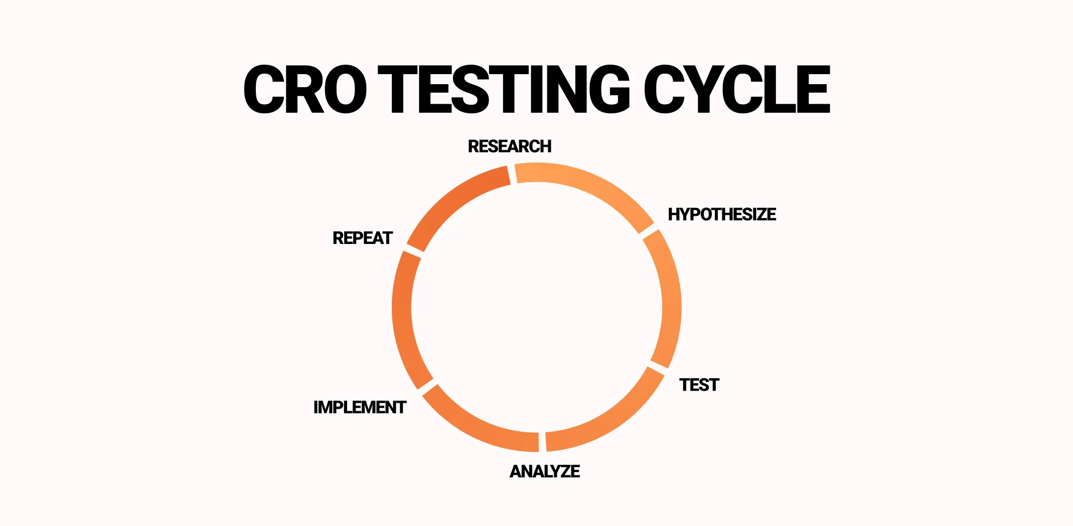
Test like a scientist
Even your most brilliant ideas are just educated guesses until you test them. A/B testing transforms assumptions into facts, which is the backbone of any serious ecommerce CRO strategy.
Build your testing machine
A solid testing framework keeps you focused and lets you actually measure results. Here’s the playbook:
- Form hypotheses: Spot friction, then predict how fixing it helps. Like, “Moving the buy button above the fold will boost add-to-cart rate by 15%”
- Prioritize ruthlessly: Use PIE (Potential, Importance, Ease) to cherry-pick high-impact tests first
- Run proper experiments: A/B test one variable at a time, or multivariate test several changes together. Make sure you have enough traffic for statistically significant results
- Track what matters: Monitor main metrics (conversion rate, average order value, cart abandonment) plus secondary stuff (time on site, bounce rate)
- Roll out winners only: Don’t go site-wide until you have clear proof it works
- Never stop iterating: Optimization is a continuous loop. One test sparks the next idea, gradually compounding wins
Don’t fall into these testing traps
Tons of stores sabotage themselves by:
- Testing everything at once, so they can’t tell what actually worked
- Treating all traffic the same, ignoring that mobile and desktop shoppers behave totally differently
- Forgetting to track secondary effects like changes to average order value or return visits
- Stopping after one test instead of building a testing culture
Your testing toolkit
Analytics platforms, heat maps, session replays, and A/B testing tools (Google Optimize, VWO, Optimizely) make this doable. Combine hard data (clicks, conversions) with softer insights (recordings, surveys) to understand not just what happened, but why.
By testing systematically, you slash risk, make confident decisions, and ensure every tweak – product pages, checkout, personalization, whatever – actually moves the needle. Continuous testing separates guessing from measurable growth.
Watch out for these landmines
Even rock-solid conversion optimization for ecommerce website plans crash and burn if you step on these common landmines. Know them now, save yourself pain later.
1. Traffic tunnel vision
Tons of store owners obsess over visitor counts while ignoring whether those visitors actually buy anything. Pumping more traffic into a leaky funnel just burns cash faster.
The fix: Boost conversion first, traffic second. A small conversion lift often beats doubling your traffic.
2. Mobile? What mobile?
Desktop and mobile shoppers are whole different cases. Ignore mobile and watch your bounce rates explode while revenue evaporates.
The fix: Test everything on mobile, optimize load speeds, simplify navigation and forms for thumbs.
3. Changing stuff blindly
Tweaking layouts, buttons, or copy without measuring? That’s not optimization, that’s gambling. Some “improvements” actually tank conversions.
The fix: A/B test changes before rolling them out everywhere.
4. Overwhelming people
Too many pop-ups, too many buy buttons, too many distractions – you’re diluting focus and killing conversions.
The fix: Keep it clean, limit calls-to-action to one clear path per page, guide people instead of assaulting them.
5. Ghosting customers after purchase
Most stores laser-focus on the first sale and completely ignore retention. That’s leaving money scattered all over the floor.
The fix: Deploy follow-up emails, smart upsells, loyalty programs – turn one-time buyers into repeat customers worth 10x more.
Dodge these pitfalls and actually apply the fixes, and your store avoids amateur mistakes while maximizing every optimization effort.
Your battle plan: Time to execute
You’ve absorbed the key levers of improving your store. Now let’s turn that knowledge into an actual plan. A structured roadmap keeps you on track, measures real progress, and ensures changes actually work.
Phase 1 – The audit (weeks 1–2)
- Measure everything: conversion rate, cart abandonment, add-to-cart rate, average order value
- Slice data by device, traffic source, customer type to find the leaks
- Dig into analytics, heat maps, session recordings to understand actual behavior
Phase 2 – Quick wins (weeks 3–6)
- Knock out easy, high-impact fixes: simpler checkout, better product photos and copy, cleaner navigation
- Add basic personalization: recently viewed products, bestseller recommendations
Phase 3 – Medium-term optimization (weeks 7–12)
- Run structured A/B tests on headlines, CTAs, product layouts
- Test behavioral triggers: exit pop-ups, cart recovery emails, post-purchase recommendations
- Keep refining mobile experience and site speed
Phase 4 – Never stop improving (ongoing)
- Document everything: results, learnings, what crushed it
- Prioritize next improvements using PIE framework
- Refine segmentation and personalization as behavior evolves
- Scale winning experiments to other products, categories, channels
Assign clear ownership
- Analytics team: Track metrics, segment traffic, report wins
- UX/Design: Implement page and checkout improvements
- Marketing: Run triggers, email campaigns, behavioral automation
- Development: Keep site blazing fast, functional, deploy tests
With a clear roadmap, you’re done guessing – every move is deliberate, measurable, and aimed at boosting conversions, revenue, and sustainable growth.
Bottom line
You’ve walked through the essentials: measuring your baseline, hunting down friction, polishing product pages, streamlining checkout, personalizing experiences, and testing everything. Each piece cranks up the odds that visitors become buyers – but executing consistently takes discipline, focus, and the right foundation.
Remember this: small conversion improvements = massive money. Know your numbers, find your biggest leaks, fix those first, then test to validate. Keep the cycle spinning – each win builds on the last.
Now stop reading and start optimizing. Your conversion rate (and bank account) will thank you.
Ecommerce CRO checklist
50+ action items to boost your conversion rate
This comprehensive checklist covers every critical element that impacts your store’s conversion performance.
Homepage & navigation
Product pages
Shopping cart optimization
Checkout process
Trust & credibility signals
Mobile optimization
Search & filtering
Email capture & recovery
Analytics & testing
Additional conversion boosters
How to use this checklist
- Audit your current site – go through each item and mark what you currently have
- Prioritize by impact – focus on items that will move the needle most for your specific business
- Test systematically – don’t change everything at once; A/B test major changes
- Monitor results – track conversion rate changes as you implement improvements
- Iterate continuously – CRO is an ongoing process, not a one-time project
Remember: conversion rate optimization is about removing friction and building trust. Every improvement should make it easier for customers to buy from you with confidence.
Skip the setup headache: Launch a conversion-ready store today
Look, you’ve just absorbed a masterclass on conversion optimization for ecommerce website success. You know how tiny tweaks can mean serious money. But building all this from scratch is months of work, thousands in developer costs, and a mountain of trial and error.
Enter AliDropship turnkey stores: Your shortcut to a high-converting shop
This is where AliDropship flips the script entirely. For just $39/month, you get a fully-built, dropshipping store that’s already dialed in with everything you just learned about – without writing a single line of code or spending weeks tweaking layouts.
Think about it: while your competitors are still figuring out WordPress plugins and fighting with checkout forms, you’re already selling. Your store launches with all the conversion essentials baked in from day one.
And there’s a 14-day free trial – so you can kick the tires, poke around, see if it clicks with your vision, all without dropping a cent upfront.
Everything you need
AliDropship isn’t just handing you a website and wishing you luck. You’re getting the whole ecosystem:
- Massive product catalog ready to go: Access to thousands of high-quality products across categories – footwear, fashion, accessories, tech, luxury items. Plus curated product packages that already work well together, so you’re not starting with an empty store wondering what to sell.
- Premium brand partnerships: We’re talking authorized suppliers for Tommy Hilfiger, Calvin Klein, Levi’s, Armani, Guess, New Balance, Gucci. These aren’t knockoffs or sketchy suppliers – these are the real deals that build customer trust and reduce returns.
- Automation that actually saves you time: Most of the grunt work runs on autopilot from day one. Inventory updates, order processing, price adjustments – handled. You focus on marketing and growth instead of manually updating spreadsheets at 2 AM.
- Built-in marketing tools: No need to hunt down separate apps or figure out integration nightmares. Automated promotion tools are already there, designed to work together smoothly. Even if marketing isn’t your strong suit, you’ve got guidance built in.
- One platform, zero headaches: Everything lives in one place. No juggling five different apps that don’t play nice together. No compatibility issues. Just a cohesive system built specifically for dropshipping.
Perfect for beginners, powerful enough for pros
Never built an online store before? No sweat. AliDropship’s turnkey stores are genuinely beginner-friendly. The setup is straightforward, the interface makes sense, and you’re not drowning in technical jargon or complex dashboards.
But don’t mistake “easy” for “basic.” These stores pack serious firepower. All the conversion optimization principles we covered – personalization, behavioral triggers, smart product suggestions, streamlined checkout – they’re all there, working behind the scenes.
Your competitive edge, day one
While other dropshippers are wrestling with technical setup, burning through savings, and learning expensive lessons the hard way, you’re already in the game. Your store is fast, mobile-optimized, and designed to convert. You’re focusing on finding customers and making sales, not troubleshooting why the checkout button disappeared on mobile.
The knowledge is in your head. The strategy is mapped out. Now you just need the store that lets you execute. That’s what AliDropship delivers – a ready dropshipping business, no technical degree required.
How do I increase my ecommerce conversion rate?
What is a good conversion rate for an online store?
Most ecommerce stores convert 2-5% of visitors, averaging around 2-3%. Fashion sees 1-2%, while health and beauty can hit 3-5%. Do not obsess over benchmarks though – focus on improving your own baseline. Even bumping from 2% to 2.5% means 25% more revenue from identical traffic.
Why is my ecommerce site not converting?
How can I reduce cart abandonment on my online store?
Show all costs upfront with no surprise fees. Offer guest checkout instead of forcing registration. Send automated cart recovery emails with product images and incentives. Use exit-intent popups for hesitant buyers. Make checkout mobile-friendly and fast. These tactics can recover thousands in lost sales.