

CTA
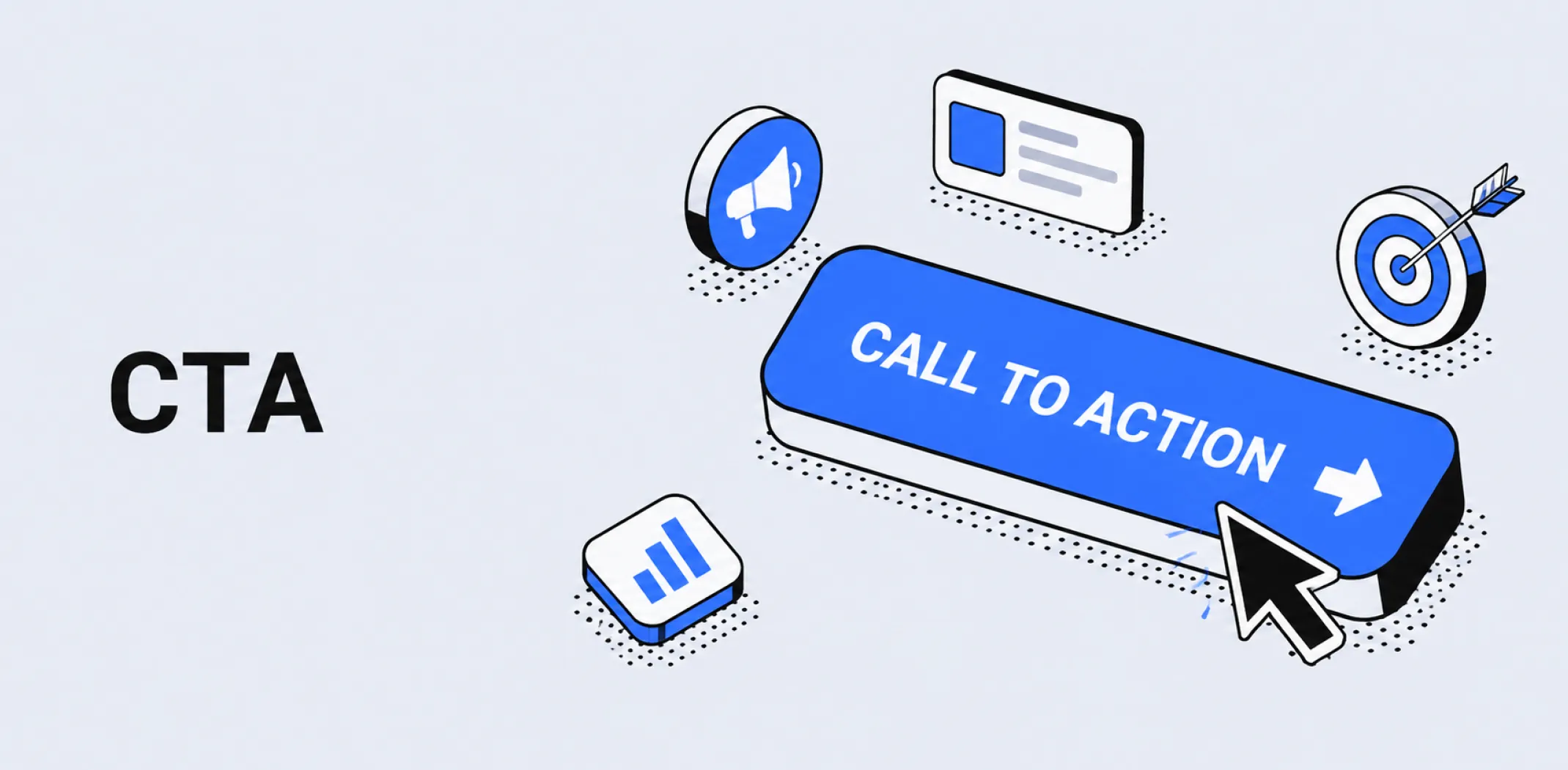
A call to action (CTA) is a prompt – presented as a button, link, or instructional phrase – that directs a visitor, reader, or viewer toward a specific next step, such as completing a purchase, signing up for an email list, clicking through to a product page, or starting a free trial.
The CTA is the point at which a page, ad, or email translates visitor attention into a measurable action. Every piece of marketing content that aims to produce a result – a paid ad, a product page, a landing page, an email campaign – contains at least one CTA, and its wording, placement, design, and clarity are among the most direct determinants of conversion rate.
A CTA is most effective when it is specific rather than generic – “Add to cart” or “Claim your 10% discount” outperforms “Click here” or “Submit” because it tells the visitor exactly what will happen when they act and what they will receive. The principle underlying effective CTA design is reducing friction and ambiguity at the moment of decision: the visitor should not have to think about what the button does or whether acting on it is worth their time.
In ecommerce and dropshipping, CTAs appear across every customer-facing surface – on product advertising creatives, product pages, landing pages, email campaigns, pop-ups, and checkout flows. The CTA on a product page is typically the add-to-cart or buy-now button; on a lead magnet pop-up it is the sign-up submission button; on a retargeting ad it is the link that returns the visitor to their abandoned cart.
Each placement requires a CTA matched to the visitor’s position in the conversion funnel – a cold audience seeing a brand for the first time responds differently to “Shop now” than a warm retargeting audience who already added a product to their cart responds to “Complete your order.”
Example
A dropshipping store selling skincare products tests two versions of the CTA button on its hero product landing page. Version A uses the button text “Buy now” in a grey button. Version B uses “Add to cart – free shipping today” in a high-contrast amber button positioned directly below the product price with a countdown timer showing the free shipping offer expiry. Version B produces a 38% higher click-through rate on the CTA button and a 2.1 percentage point increase in overall page conversion rate over a two-week test period. The improvement is attributable to three factors: specific benefit language in the button text, visual contrast that draws the eye, and urgency created by the time-limited offer – each of which reduces friction at the moment of decision.
Key characteristics
- Action-oriented language: Effective CTAs use verbs that describe the action and its immediate outcome – “Add to cart,” “Claim discount,” “Start free trial” – rather than passive or generic phrases that leave the visitor uncertain about what will happen next.
- Visual prominence: A CTA button should be visually distinct from surrounding page elements through contrast, size, and positioning – if a visitor has to search for the next step, friction is introduced at the most critical point of the conversion path.
- Placement above the fold: The primary CTA on a landing page or product page should be visible without scrolling on the majority of devices, ensuring that visitors who do not scroll still encounter the conversion prompt.
- Funnel stage alignment: CTA language and commitment level should match the visitor’s position in the buying journey – a cold audience requires a lower-commitment prompt (“See the collection”) than a warm audience that has already expressed purchase intent (“Complete your order”).
- Single primary CTA per page: Pages with multiple competing calls to action dilute focus and reduce conversion rates; the most effective landing pages and product pages present one dominant CTA with all other elements supporting it.
Related terms
- Conversion funnel – the staged path from awareness to purchase in which a CTA serves as the mechanism that moves a visitor from one stage to the next, with the wording and commitment level of each CTA calibrated to the stage at which it appears.
- Landing page – a page built around a single conversion goal in which the CTA is the central element toward which all other content – headline, images, social proof – is oriented.
- Lead magnet – a free offer presented alongside a CTA that prompts visitors to submit their email address, used to build a subscriber list from traffic that is not yet ready to purchase.
- Upselling – a post-purchase revenue tactic commonly executed through a secondary CTA presented after the primary conversion, prompting the customer to add a higher-value item or complementary product before completing checkout.
- Average order value – a metric directly influenced by the placement and wording of secondary CTAs on product pages and at checkout, where bundle offers and add-on prompts increase the value of each completed transaction.
Frequently asked questions
What makes a call to action effective?
An effective CTA combines specific action-oriented language, visual prominence, and placement at the point of highest purchase intent. The button text should describe both the action and its immediate outcome – “Add to cart – free shipping” communicates what happens and what the visitor receives, reducing the hesitation that generic text such as “Submit” or “Click here” creates.
Visual contrast between the CTA button and the surrounding page elements ensures the visitor’s eye is drawn to it without having to search. Placement immediately below the price and key benefit statement – before the visitor has to scroll – captures decision-making momentum at its peak.
How many CTAs should a landing page have?
A landing page should have one primary CTA repeated at logical intervals – typically above the fold, after the key benefit section, and after the social proof section – rather than multiple competing calls to action pointing in different directions. Research on landing page conversion consistently shows that pages with a single focused CTA outperform those with several options, because choice creates hesitation.
Secondary CTAs – such as a “Learn more” link for visitors not yet ready to buy – may be included but should be visually subordinate to the primary action and positioned so they do not compete with it for attention.
Does CTA button color affect conversion rate?
Button color affects conversion rate primarily through contrast rather than through any universal color preference. A CTA button that stands out clearly from the surrounding page background and content draws more clicks than one that blends in, regardless of its specific color.
The most commonly cited high-performing CTA colors – orange, green, and red – perform well in many contexts because they contrast against the white or neutral backgrounds typical of ecommerce pages. The most reliable approach is to test button color and contrast as part of a structured A/B test rather than to apply a universal color rule, since the optimal choice depends on the specific page design and audience.
What is the difference between a primary and secondary CTA?
A primary CTA is the main conversion action a page is built to drive – typically “Add to cart,” “Buy now,” or “Sign up” – and is the most visually prominent element on the page. A secondary CTA offers an alternative lower-commitment action for visitors not yet ready to complete the primary goal – “See all products,” “Read reviews,” or “Learn more” – and is visually subordinate to the primary button.
Secondary CTAs serve visitors earlier in the decision-making process and can reduce bounce rates by providing a next step for undecided visitors, but should never compete visually with the primary action.
AliDropship: An all-in-one platform for starting dropshipping in 2026
AliDropship is a dropshipping platform that covers store creation, product imports, order automation, and marketing within a single system. It is designed for users with no prior ecommerce experience, though it also supports scaling for more established stores.
🛍️ Free turnkey store
New users receive a free pre-built store – set up, designed, and stocked with products. The store includes a ready-to-use product catalogue and a standard storefront design. It also comes with hosting, a domain, SSL, and payment systems already set up and included.
📦 Products
The platform provides access to a product catalogue covering both trending and niche items, with one-click import to your store. The catalogue is updated regularly to reflect current market availability. Products can be browsed, filtered, and added without leaving the platform.
🚚 Shipping & fulfillment
AliDropship provides access to a vast catalogue of products from global suppliers and handles order fulfillment automatically once a purchase is made. Customers receive tracking information directly, and orders are processed without manual intervention from the store owner.
📣 Marketing & promotion tools
The platform includes built-in marketing tools covering email campaigns, discount management, SEO settings, and social media integration. These are available within the dashboard and do not require third-party subscriptions for basic use.
👌 Ease of use
AliDropship requires no coding knowledge. The dashboard contains all the necessary tools for managing your store, products, and orders in one place. Additional features and products can be added as the store grows without rebuilding the existing setup.
What makes a call to action effective?
How many CTAs should a landing page have?
Does CTA button color affect conversion rate?
What is the difference between a primary and secondary CTA?
Where should a CTA be placed on a product page?
Are you ready to become an owner
of a profitable online business?
Free Dropshipping Guide